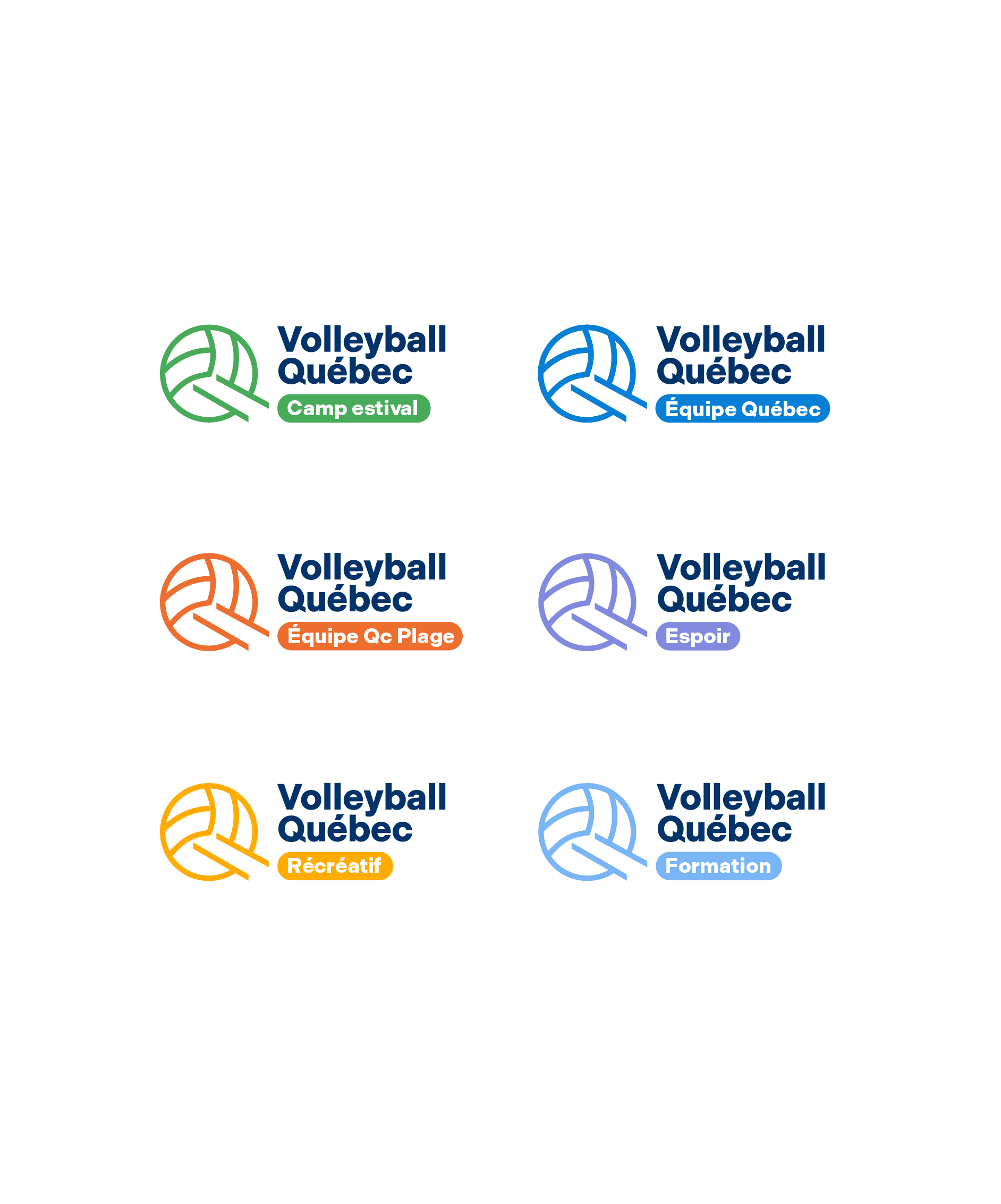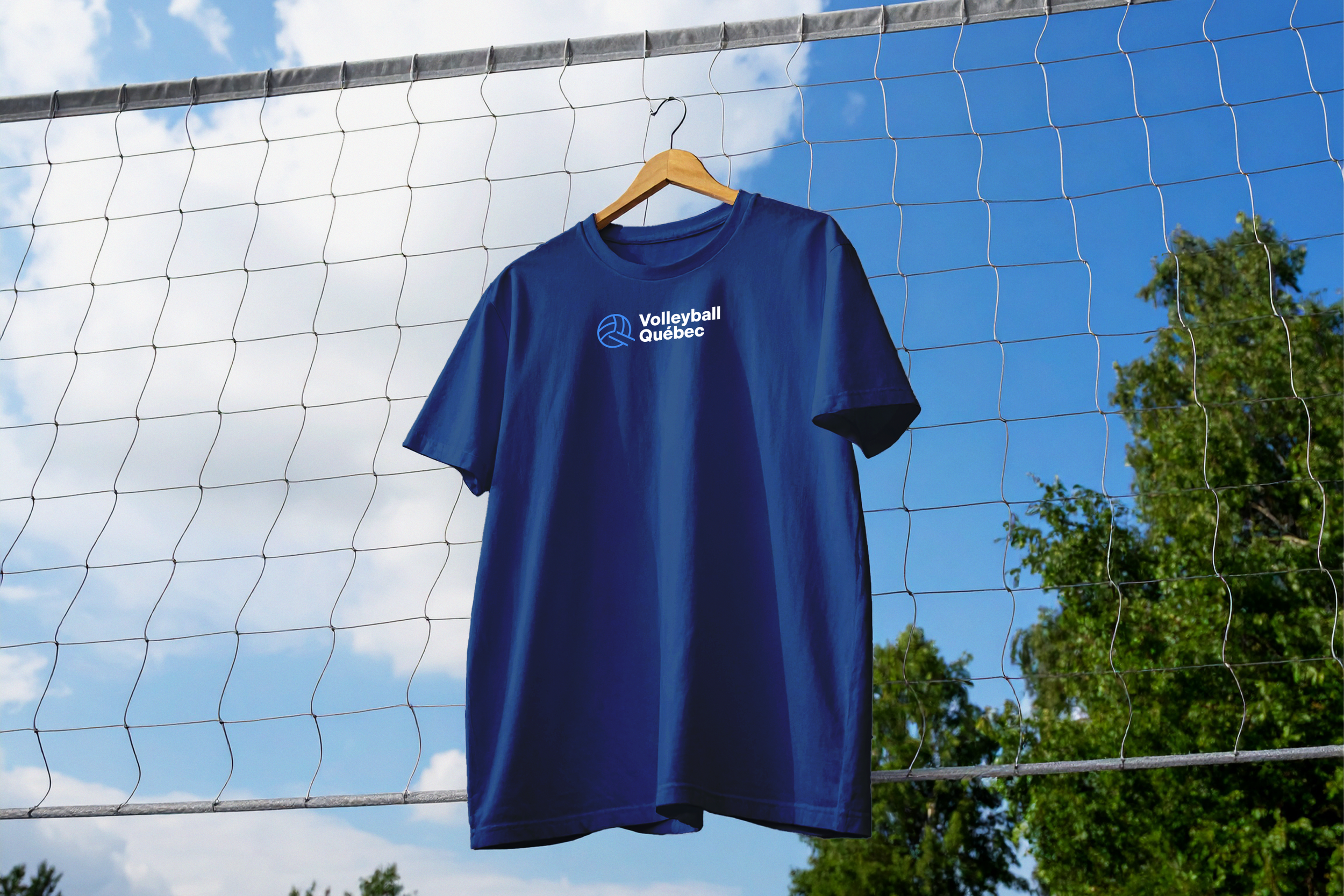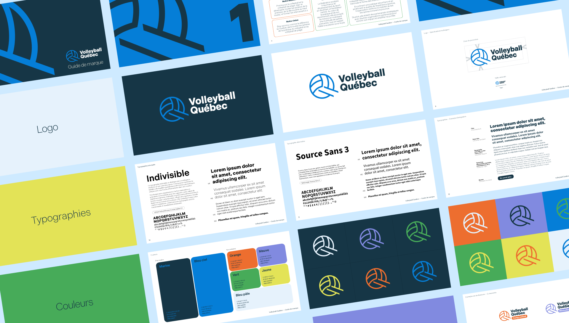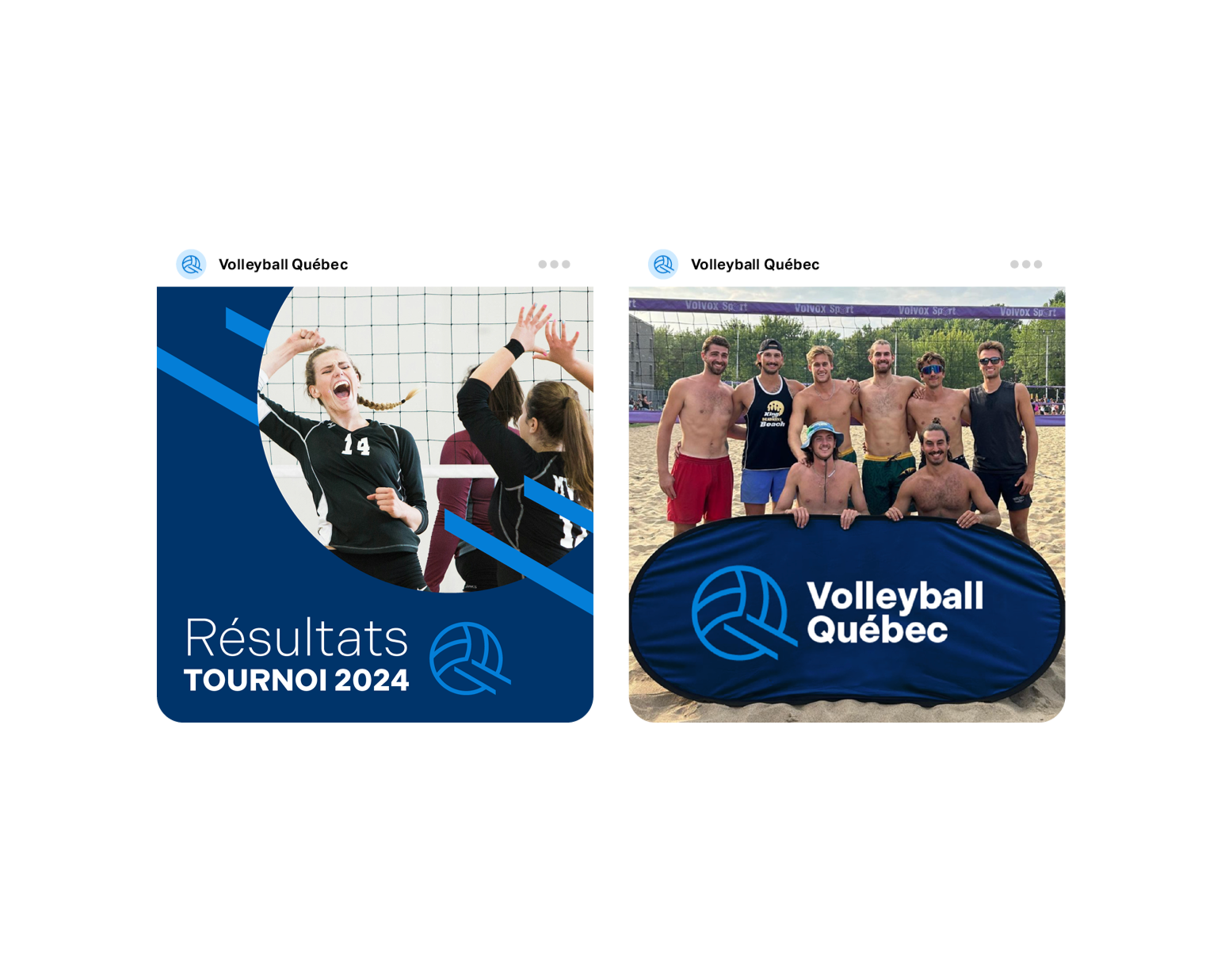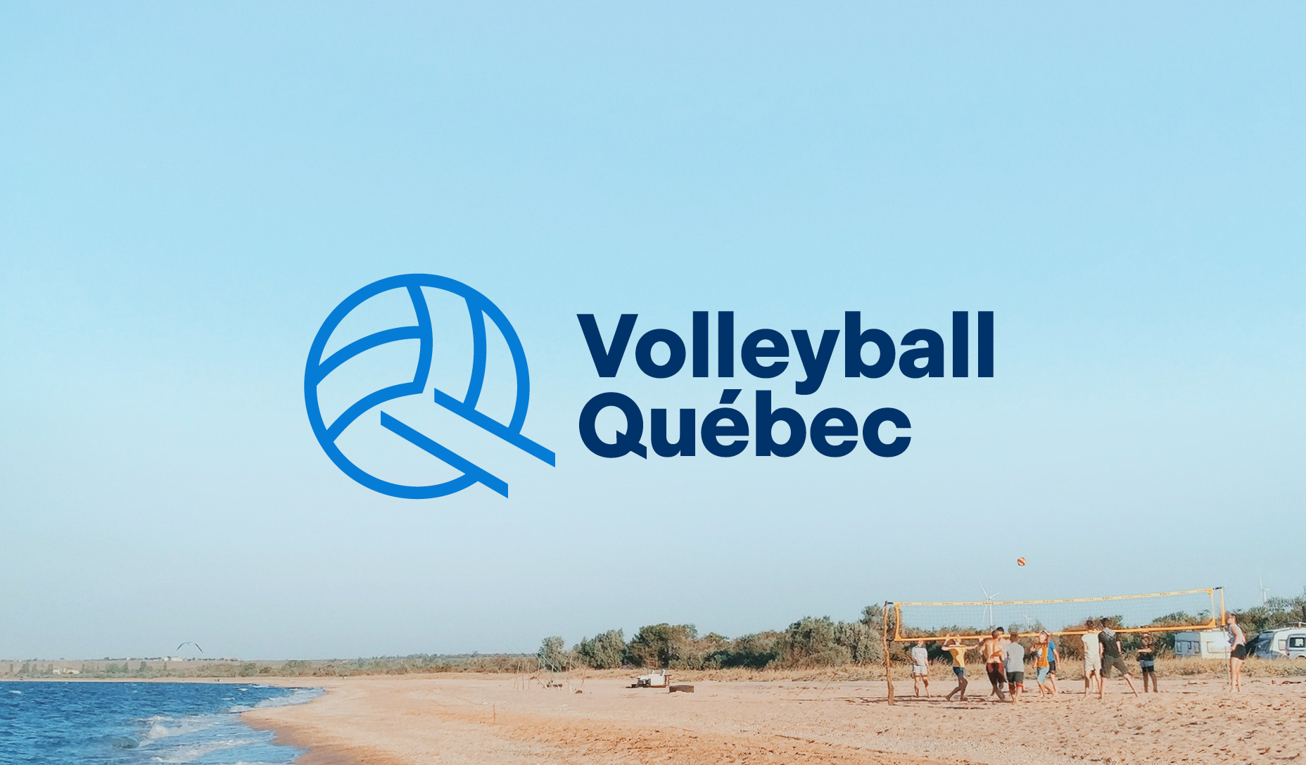
DescriptionLe rebranding de Volleyball Québec visait à créer un emblème contemporain, capable de traduire l'énergie du sport tout en affirmant l'ancrage territorial de l'organisation. Le symbole fusionne un ballon épuré et des lignes de mouvement qui dessinent simultanément le « Q » de Québec. Cette double lecture permet au logo de fonctionner à la fois comme emblème sportif et marqueur identitaire. Soutenu par une palette vibrante et un bleu affirmé, le système visuel est clair, lisible et facilement déclinable à travers les catégories et niveaux de pratique. Une identité moderne et immédiatement reconnaissable.
The rebranding of Volleyball Québec set out to create a contemporary emblem capable of capturing the sport's energy while affirming the organization's local roots. The symbol merges a clean volleyball with motion lines that simultaneously trace the "Q" of Québec. This double reading lets the logo work both as a sporting emblem and an identity marker. Backed by a vibrant palette and a bold blue, the visual system is clear, legible and easily adapted across categories and levels of play. A modern, instantly recognizable identity.
Identité visuelle
Identity
RôleSDirection de création et artistique, design graphique
Creative & Art Direction, Graphic Design
Canidé
2025, 2026
Volleyball Québec